


Dogwood Solutions Rebrand
I joined the Dogwood team at an exciting time for the marketing company. The founder was looking to expand the company and establish a local presence in the Boise market. While the company didn’t want a name change, they wanted updated brand language and visuals that felt modern and vibrant. I, the sole graphic designer on this project, partnered with the copywriters on the team to give the brand an entirely fresh look.
When examining the logo, the old Dogwood Solutions logo looked very classic and felt like it was a hospitality logo, perhaps seen on the face of a hotel. I wanted to modernize the logo so after many iterations, we landed with a logo with only a sans serif font and a more clean lock-up. The logo is straightforward and now better suited for a communications company.
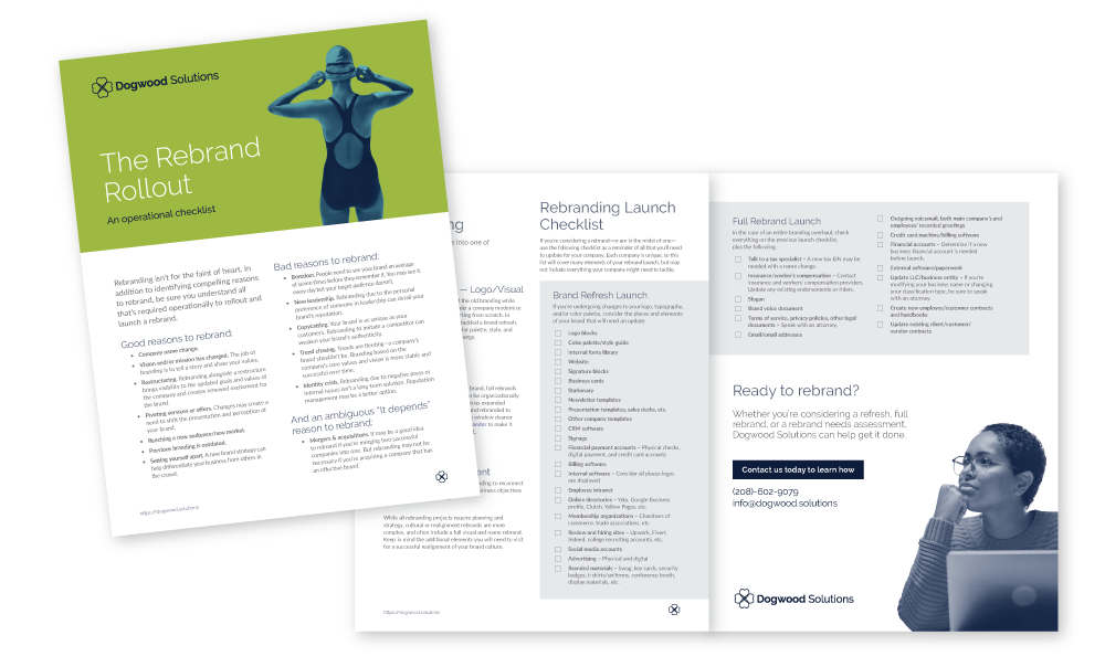
In building out the visual language for the new brand, I selected colors that are vibrant and the pairings can be somewhat unexpected, leaning into the bold, playful personality of Dogwood. The images are in natural settings with a diverse group of humans, ideally taking bold action. The duo-tone treatment of the images helps unify the images and further emphasize the brand.
I developed many items to build out the brand, including both a one-page brand overview and a comprehensive brand guidelines document, stationary, social media graphics, document templates, and a website.